The Glow Circuit

Overview
The Problem
The Glow Circuit (TGC) was born from founder Linda O’Farrell’s visionary mission to help people live deeply fulfilling lives by fostering resilient, connected communities prepared for the future. In an oversaturated wellness landscape often fragmented, cliché-ridden, and jargon-heavy, TGC sought to pioneer an entirely new category: total life fulfilment. This category goes beyond superficial wellness trends to embrace holistic wellbeing that genuinely supports every individual - across all ages, genders, and backgrounds - through a science-backed, community-driven movement.

Insights
The brief was clear yet ambitious: create a bold, iconic brand identity, campaign, and digital platform to launch TGC’s unique offering of expert-led movement, evidence-based mentorship, and vibrant communal empowerment. We needed a brand that would disrupt typical wellness narratives by communicating a powerful and unifying sense of shared growth, vitality, and betterment. It had to feel inclusive, credible, and inspiring.
Our objective was to craft a differentiated, coherent identity that authentically articulates TGC’s rigorous yet compassionate approach, one that positions the organisation as the trusted authority and catalyst for lifelong personal and communal development. Importantly, the brand needed the flexibility to support future growth into franchise opportunities and product lines, while resonating broadly across diverse and evolving audiences.
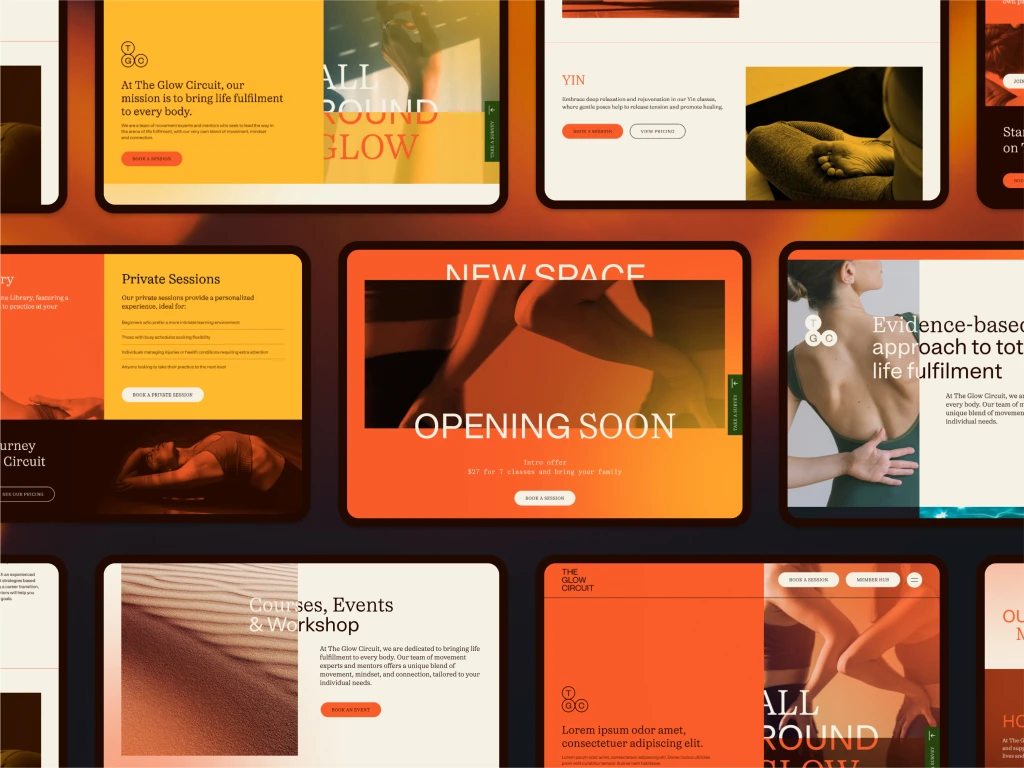
Execution
The concept “Shifting States” became the dynamic core of The Glow Circuit brand - visually and conceptually expressing the fluid interplay between logic and passion, evidence and intuition, and individuality and collective synergy.
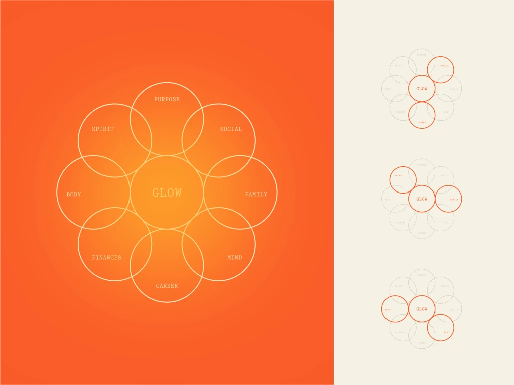
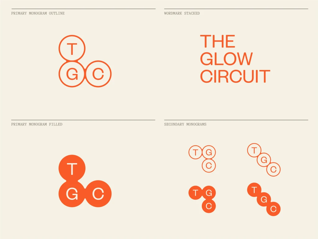
The visual ID centres around TGC’s eight quadrant ‘Glow’ methodology. The TGC brandmark is adapted from this approach’s diagram. The acronym of TGC always places the G central, with the T and C with a gravitational pull toward it.
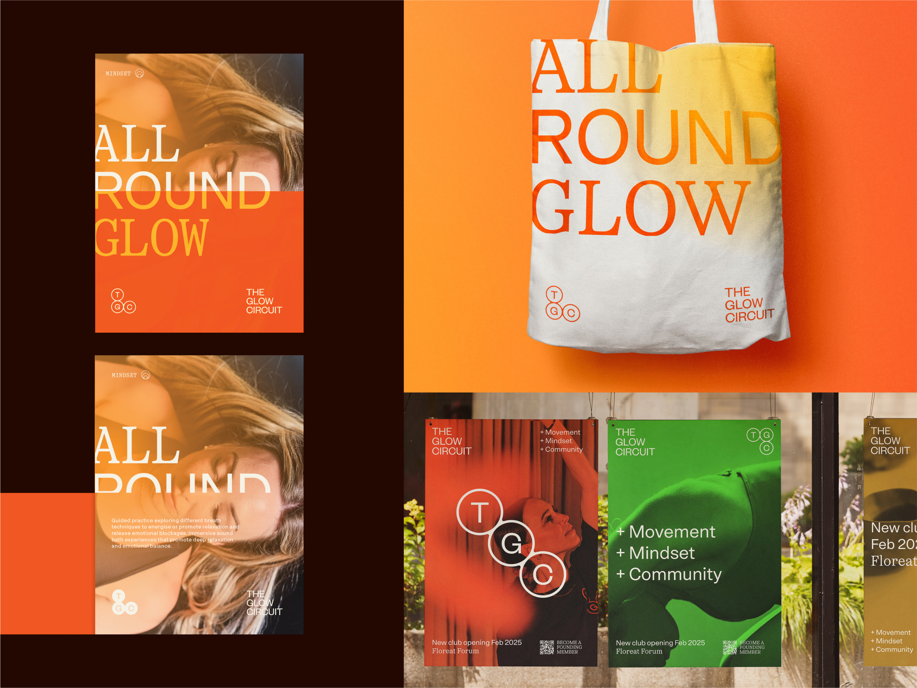
The colour palette leans heavily into the idea of Glow, with warmth at its core.
The typography is derived from a more evidence-based approach to wellness and balance. Using a pairing of serif and san-serif to create avenues to speak dynamically through typographic duality.
This nuanced balance was captured through an emotionally rich and authentic photography style, bringing the brand’s evolving identity vividly to life through flowing, vibrant imagery. This takes the form of Mind, Movement and Community, through dynamic cropping, layers and human subject. Supported by more ambient found textural photography with the pillars of Glow, Focus and Movement.
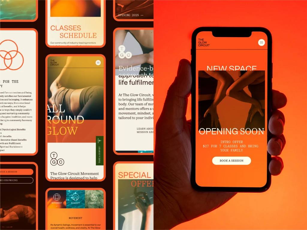
The engagement extended digitally through a purpose-built website and member portal designed as an immersive, user-centric hub. The integrated experience solidifies The Glow Circuit’s reputation as a leader and pioneer in comprehensive life fulfilment, empowering members both personally and communally.
The design and platforms have resonated strongly with the desired audience, establishing TGC as both trustworthy and transformative - effectively disrupting the wellness category with authenticity and heart.
The outcome
The Glow Circuit brand transcends traditional self-care. The "Shifting States" concept visually and conceptually represents continual growth and balance, making the brand feel dynamic and accessible.
We saw The Glow Circuit’s approach to the industry as holistic and transformative and wanted to create a brand that spoke to that with a more disruptive approach that didn’t stray too far away from its intentions at heart. The end result is a pivot in aesthetics from muted calming tones and themes, to welcoming, warm and transformative brand, creating cut-through with approachability.
The Glow Circuit brand moves beyond traditional self-care, with its “Shifting States” concept embodying continuous growth and balance. This idea is expressed both visually and conceptually, giving the brand a sense of dynamism and accessibility.
We viewed The Glow Circuit’s presence in the industry as both holistic and transformative. Our goal was to design a brand identity that reflected this vision while introducing a more disruptive edge, one that pushed boundaries without losing sight of its core intentions. The result is a shift in aesthetics, moving away from muted, calming tones toward a warmer, more welcoming and transformative expression, creating stronger cut-through with approachability.
Project Credits
- Brand Strategy
- Visual Identity
- Website development